Product Design

Reese's Product Design

Client:

Coffee Company

Industry:

Retail

Region:

US

Duration:

4 Weeks

Budget:

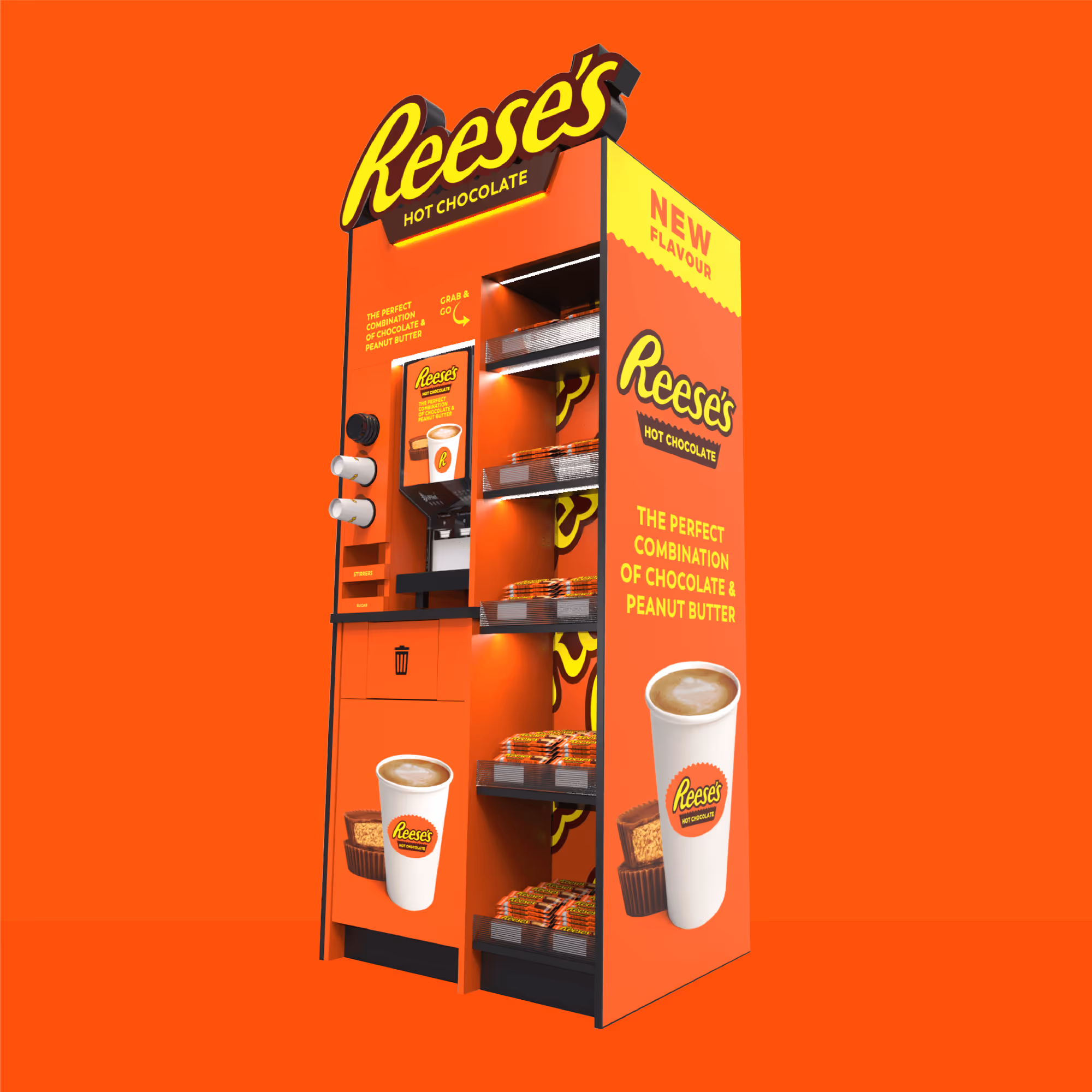
We created a bold, eye-catching product display for a client looking to showcase the new Reese's Pieces Hot Chocolate in local shopping centres. Designed to stand out and drive sales, the stand features vibrant Reese's branding with signature orange, brown, and gold tones, highlighting the indulgent nature of the hot chocolate and its recognisable brand.

No items found.

Our Approch

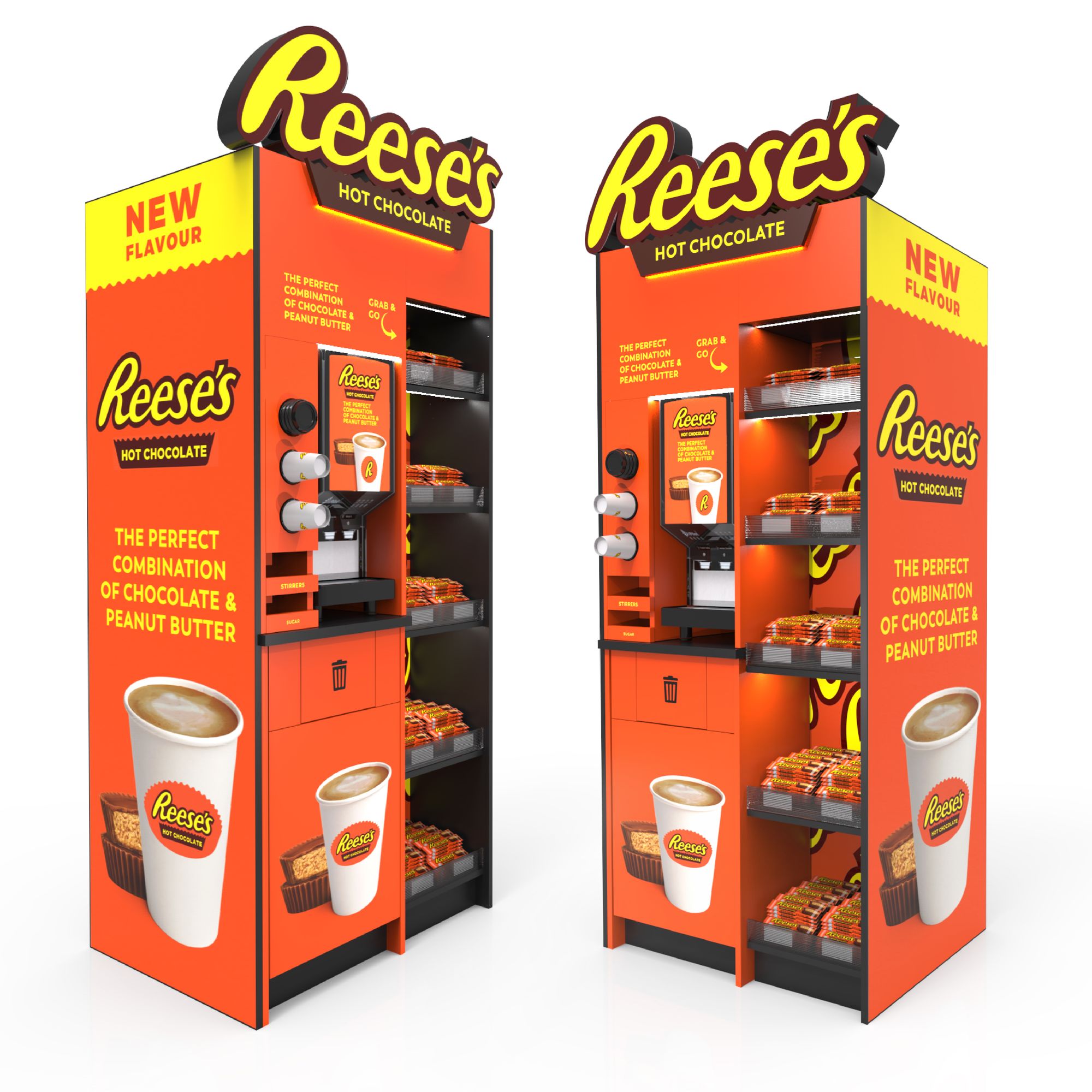
Our design emphasises a fun, memorable experience that blends brand recognition with customer engagement, making each cup of hot chocolate a must-try indulgence. Sustainable materials and eco-friendly packaging will align with modern environmental values,completing an impactful, responsible display.

The challenge

  • Sustainability Concerns
    • The initial concept relied heavily on plastics and non-recyclable materials.
    • Reese’s required a fully sustainable design without compromising durability or user experience.
  • Structural Integrity
    • A hot chocolate tower involves liquid flow mechanics and needed materials strong enough to hold hot beverages safely.
  • Brand Alignment
    • The product had to embody Reese’s playful, bold identity while showcasing sustainability.
    • Packaging and presentation had to be eye-catching for seasonal retail displays.
  • The solution

  • Sustainable Construction
    • The tower was designed as a solid structure using Egger board, a sustainable, wood-based material known for durability and eco-credentials.
    • The top serving and flow surfaces were finished with a solid surface worktop, ensuring a food-safe, heat-resistant, and easy-to-clean platform.
  • Premium, Reusable Design
    • The combination of Egger board and solid surface materials ensured the tower could withstand long-term use, aligning with circular design principles.
    • Modular assembly allowed for ease of transport and re-use at multiple events.
  • Brand-First Experience
    • Tower surfaces were finished with Reese’s vibrant brand colours and bold graphic identity.
    • The solid build created a striking visual centrepiece that reinforced Reese’s playful, indulgent brand positioning.
  • No items found.

    Measurable results

    Other case studies

    Interested in our Unlimited Design request subscriptions?

    High-quality design support whenever you need it. Submit as many requests as your business requires each month.

    Our in-house team handles everything from digital assets to 3D visuals.

    Book a free call
    More Templates